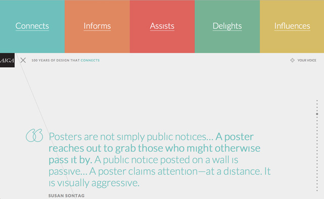
News Site Design
10 Essential Concepts in Digital Design

I. Know your audience: Who is coming to your site and why?
II. Outline site goals, content, functionality, look and feel: What are your site objectives? Detail the types of content, tools and site sensibility. Map out the site sections.
III. Establish logical information architecture: How is information organized, categorized? What is most important, less important? Clarity and consistency are key, followed by creativity.
IV. Understand visual logic: Use principles of visual logic to establish hierarchy and communicate relative importance of content
V. Create clear, intuitive navigation: Will users move easily through the site? Is content navigable topically? chronologically?
VI. Use clean, scannable, responsive layouts: How are the elements arranged most logically and effectively on the page? Design for multiple platforms.
VII. Avoid clutter, aim for simplicity, use white space:Avoid unnecessary design elements. The white space between graphics, fonts, etc is as important as the elements themselves.
VIII. Use appropriate font types and styles: What do your font types, sizes, colors communicate to the users about your organizational ethos and purposes? Is your content readable? Is the emphasis accurate?
IX. Use a site color palette to increase clarity and coherence: Use color systematically to make certain text or graphical items stand out.
X. Concentrate on consistency and usability: How do your design choices sync with user behavior online? Are you designing for users or for your peers?
I. Know Your Audience
* Identify the ages, interests, background and expectations of your potential visitors. This will impact the graphics you create, the colors, fonts, tone and visual metaphors for your site.
* Successful sites are those that blend design with functionality: sites that begin by defining an audience during the initial design stage and then continue to keep the audience in mind throughout the development process.
II. Outline Site Goals, Content, Functionality, Look and Feel
Creating a Site Map or Navigational Flowchart
*Map out your site, indicating hierarchy — primary, secondary, tertiary content — and how users will navigate from one page to the next.
*Two typical programs used to design site maps are Omnigraffle and Microsoft Visio
 * Draft a design brief in which you specify the general look and feel of the site: fonts, color palette.
III. Establish a Clear Information Architecture
As in every medium, structure and organization are the starting points for an online site, whether it is a daily news site, special project or documentary. The key is to use the structure of the site to guide users, tell them what is most important and how things are related.
Clearly identify and define the different types of content on your site. Prioritize and group this content in a logical fashion. In the example of WordPress, think about the topical content categories vs. static background information found on pages vs. key word tagged content.
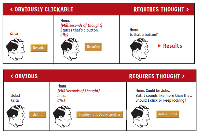
“Don’t Make Me Think”

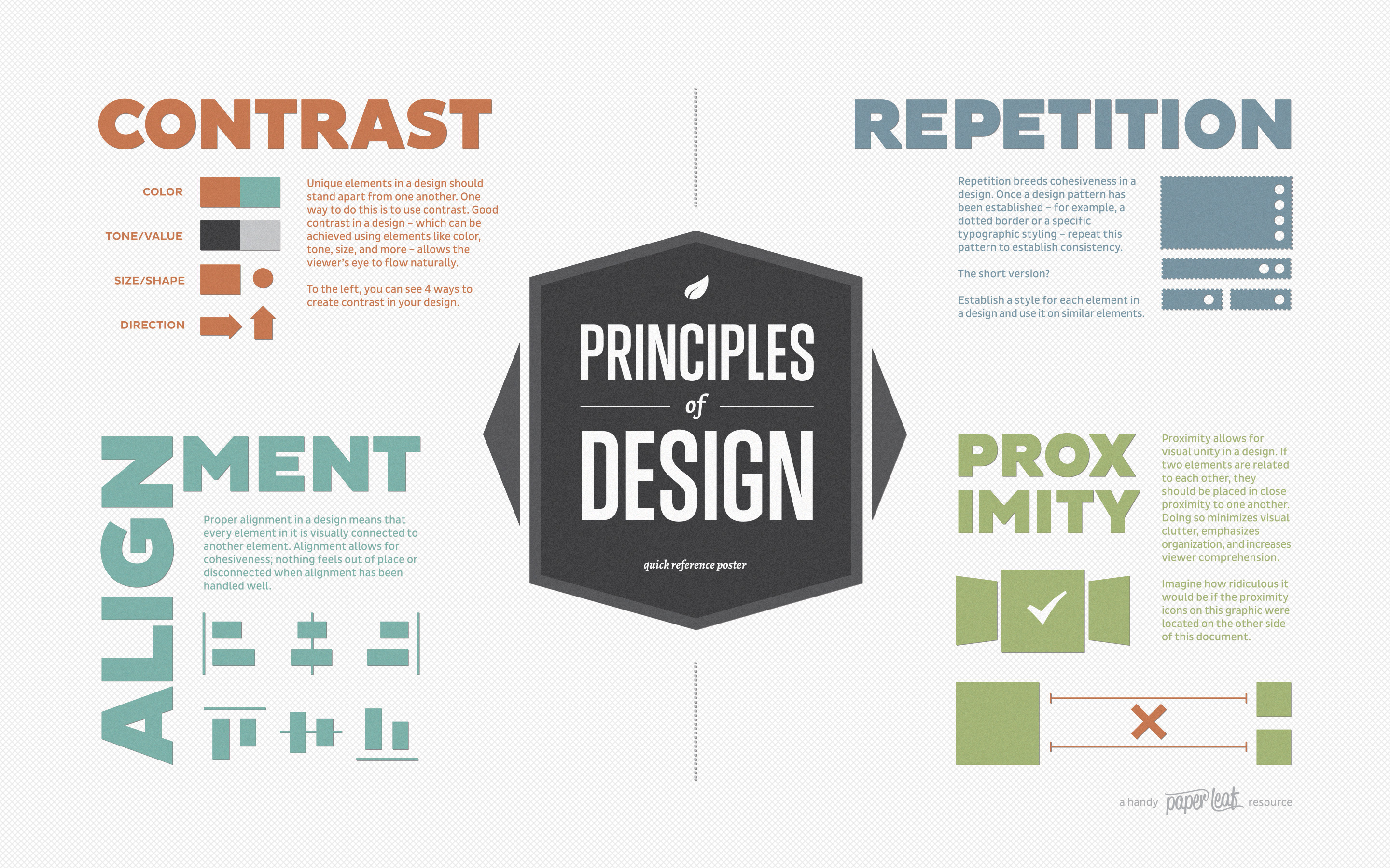
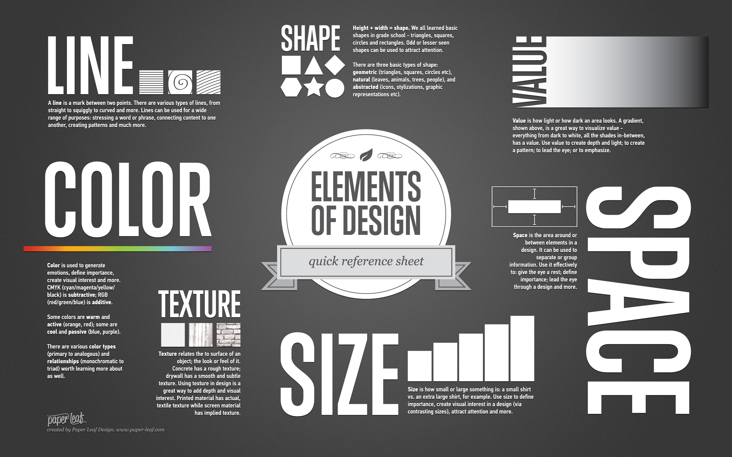
IV. Principles of Design
“Through placement and grouping and hierarchy, good design frees up mental space so users can think about content, and not where they’re supposed to be looking and how to interpret what they’re seeing.” — ProPublica Principles of Design
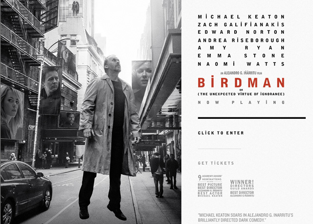
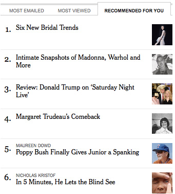
Why do we look at things the way we do? The answer is a combination of nature and training. When presented with a range of visual stimuli, the eye tends to look at certain things before others. A rule of thumb:

Big to small: We see big things first, small things second.
Top to bottom: We start at the top and go to the bottom, assigning characteristics to content in both locations.
Left to right: Many of us have learned to read from left to right, this carries over into web scanning.
Dark to light: We look at darker items first and lighter items second because the former are easier to see.Designers must use these principles of visual logic to establish hierarchy and communicate relative importance of content to users. Source: Web Journalism, James Stovall
Contrasting color, size and typography can enhance a design and draw attention to an area of the page by creating emphasis.
Repetition and consistency of your design elements help users navigate your site.
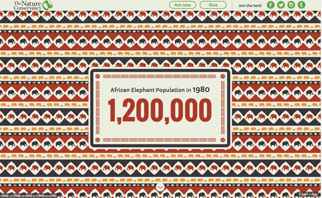
The Nature Conservancy
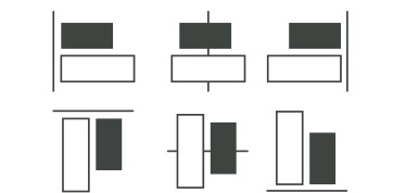
Alignment
V. Create Clear, Consistent Navigation
Online news content can be organized in a myriad of ways, simultaneously, by topic, chronology, geography, popularity, audience and content type. There can be any number of levels of navigation — primary, secondary, tertiary — and functional options – pulldowns, breadcrumbing, tabs, carousels, pulldown menus, accordions, search, pages, thumbnails, graphics, maps.
Linear vs. interactive experience
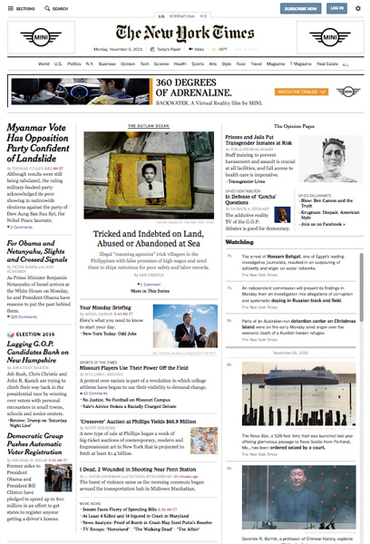
The print version of the NYT front page is primarily content, offering five section blurbs at the bottom. Online news is much more exploratory and interactive in nature. With over 100 choices on the home page of the nytimes.com, an individual user’s behavior will be unique and subjective.

Principles of navigation:
Logos and navigation should be in the same place and have the same functionality from one section of the site to the next. Make sure users can always get where they want by adding additional navigation such bread-crumbing and “back to the top” on long pages.
*Navigation reflects information hierarchy
*Global navigation is found on every page of your site
*Logo or header should always be linked to the home page
*Traditionally, footer text navigation duplicate the global navigation
*Top and left-hand navigation are most typical, following most people’s tendency to read top to bottom, left to right
*Other types of navigation include carousels, tabs, fat footers, breadcrumbing
*A site map or site index is often included in larger sites. It lists all content in a traditional outline format, providing an easy way to find content and also aids in search engine recognition.
Examples of types of navigation:
1) Global: These are the primary level links found on every page. In the case of newspapers, these are often text links to the main sections.
Some sites using horizontal navigation use a tab-like sublevel nav as well.
 2) Secondary: These are links to second-level or sub-sections. They can also be supporting information such as “Contact Us”, “About Us”.
3) Site logo: Linking the site logo to the home page is standard practice.
4) Breadcrumbing:

5) Carousels:
 Frontline


6) Tabs

VI. Use Clean, Scannable, Responsive Layouts
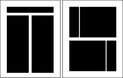
One way to group items and use white space appropriately is to start with a grid. A grid-based layout, with appropriate gutter sizes, allows for plenty of room between sections, and in many cases it forces the designer to implement principles of proximity without even thinking about it.

12 Column Grid demo This site shows you the different ways you can break down content using the grid.
Resources: The Grid: The Structure of Design, Designing With Grid-Based Approach
How a Simple Layout Can Be Mixed ‘n’ Matched with Patterns, Photos and Backgrounds
Most news web sites use a grid layout. One reason for this is the vast amount of content being presented and the need to organize it by topic, media type.

Create balance
Elements should seem balanced and well-proportioned on the page. This does not mean they need to be symmetrical, but neither side should feel heavier or weighed down by elements than the other.
When a design can be centered or evenly divided both vertically and horizontally it has the most complete symmetry possible. Symmetrical balance generally lends itself to more formal, orderly layouts. They often convey a sense of tranquility or familiarity or elegance or serious contemplation.
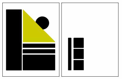
Asymmetrical layouts are generally more dynamic and by intentionally ignoring balance the designer can create tension, express movement, or convey a mood such as anger, excitement, joy, or casual amusement.
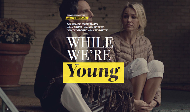
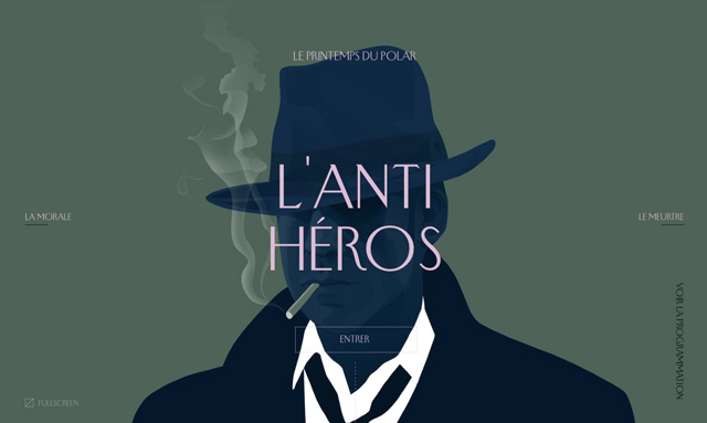
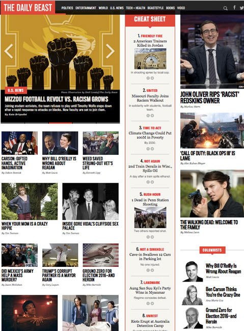
Magazine and television sites: While still using a grid, many online magazines or television sites are visually distinct, varying the traditional newspaper layout.
Online Magazines with Interesting Design
Wired
WSJ Magazine
Vanity Fair
T Magazine
Interview Magazine
Responsive Design
One aspect of the user experience which is out of the web designer’s hands is the platform being used to view the site. Aim to create a design that will adapt across platforms. This may mean changing navigation and functionality entirely for different screens.
You can test the “responsiveness” of designs on Firefox by using Tools > Developer > Responsive Design View

VII. Avoid Clutter, Aim for Simplicity, Use White Space
Avoid unnecessary design elements. The white space between graphics, fonts, etc. is as important as the elements themselves.
This may not mean literally “white” but rather empty space, places on the page with minimal activity. By leaving breathing room, you allow site visitors to focus on the main content without appearing cluttered or amateur.

This study found that by adding white space through making text more concise, adding bulleted items subheadlines and tighter writing increased the reader’s comprehension and enjoyment of online articles.
Resource:
Whitespace: The Underutilized Design Element
Nielsen Eyetrack Study
VIII. Use Appropriate Font Types and Styles

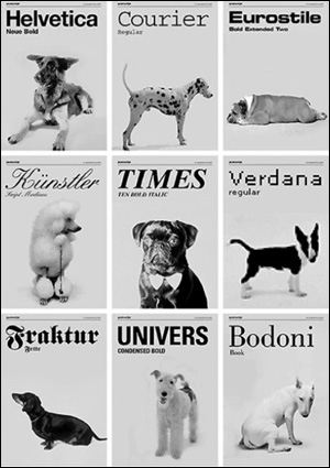
Fonts Convey Character
Use fonts judiciously and consistently throughout the site. Fonts do more than spell out your copy — they are strong design elements that communicate a site ethos to users.
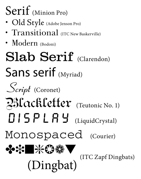
Samples of sans serif typefaces
Samples of serif typefaces
Samples of monospaced typefaces
Think of your typography as a hierarchy
When you’re assigning your fonts, sizes, and colors to your text, the more hierarchical you are the more effective your pages will be. By using a hierarchy of typography, you make it easier for your readers to find exactly what they are looking for on the page.
– Try to use no more than three different types per site. Instead vary weight, size, caps, etc.
– Pick one font type and style for each element of your site: headlines, subheads, captions, body text.
– Don’t randomly change text types or line spacing.
– Serif fonts for headlines and sans-serif for body text can provide good contrast between the two.
– Avoid Papyrus and other whimsical fonts unless you are writing something about Egyptians.
– Italics are hard to read online and ALL CAPS scream out your message.
– Use bold or blockquote to emphasize.
– Sans serif fonts can be easier to read online (for example Arial)
– Be aware that readers can easily change the font size with their browsers.
Typography conveys tone, mood and emotion
This chart illustrates some of the visual cues fonts can convey to readers. If you choose to go with a more stylized font, choose one that is in sync with your content and the tone of your story.

Legibility is Critical
You site may be colorful, but if visitors can’t read your copy, or if it strains their eyes, it is working against you. Black (or dark) text on a light background is the easiest to read. White text on black background “vibrates” and can strain the eyes.
When compared to reading light text on a dark background, people read black text on a white background up to 32 percent faster. In general, the greater the contrast between the text and background, the easier the text is to read.
Another example of illegible text:

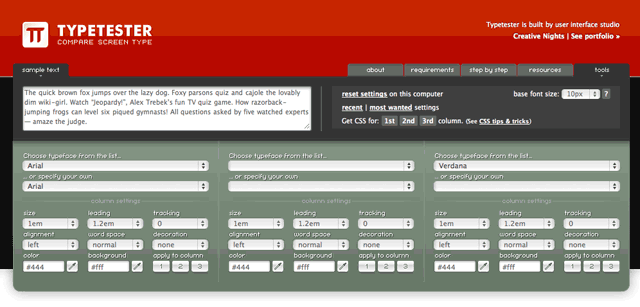
Typetester.org
You can use this tool to compare fonts side by side.
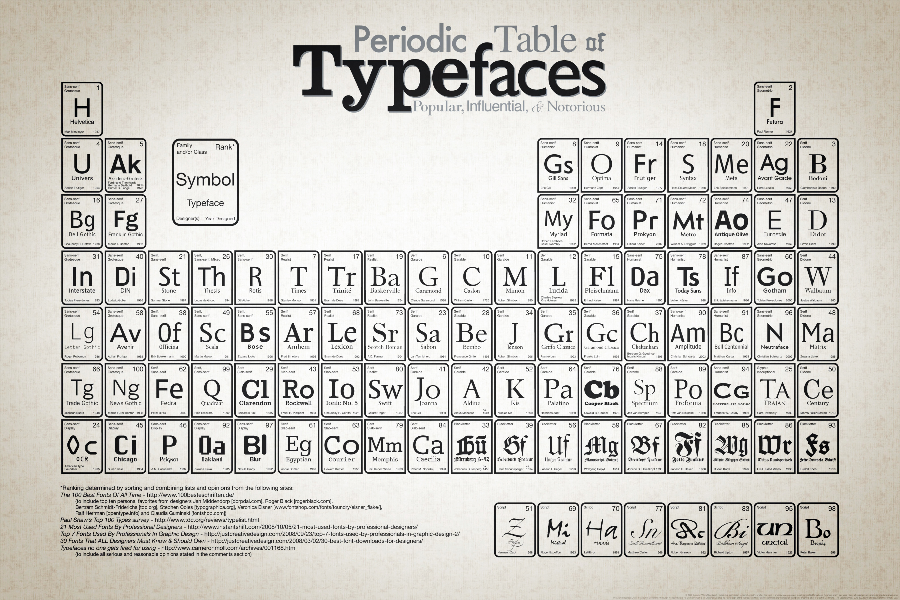
Periodic Table of Fonts
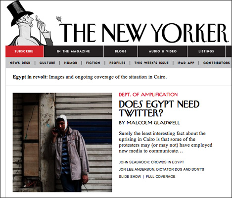
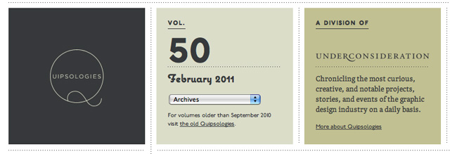
Sites with creative usage of fonts:
New Yorker
Quipsologies
IX. Use a Color Palette to Increase Clarity, Consistency and Coherence
Use color systematically to make certain text or graphical items stand out and to help users navigate your site. Adding color backgrounds to different site sections, for example, can help identify them as a group. Color contrast with text is critical for readability. But certain color combinations make reading difficult.
Killing Kennedy
 All images must be in RGB color mode, with all graphics, backgrounds and text created using hexadecimal values: the name given to a color’s web equivalent comprised of a combination of six letters and numbers consisting of A-F and 0-9.
The foreground and background colors should be contrasting
A light background color (preferably white, very light shade of gray or pale yellow) is ideal when the text is in a dark color (black). This creates a good contrast and is easy on the eyes; especially true if the web site has lots of textual content.
Harmonizing colors
The colors of the different sections of the site should harmonize. If not, it creates a very blocky effect and can be a major eyesore. When working with colors you need to create a balance – make the web page a single identity rather than segregating it (visually) with different colors.
Understanding color theory will help you to understand how color works on Web pages. And one of the first places to start learning color theory is with the color wheel. Sir Isaac Newton first put together a circular diagram of colors in 1666. This color wheel allows you to see groupings of colors that are harmonious together and other colors that might clash.
Primary Colors
The primary colors are RED, YELLOW, and BLUE. These colors, in traditional color theory, cannot be formed by mixing any other color. All other colors are derived by combinations of these colors. They are represented in HTML as:
Red: #ff0000 or #f00 in CSS
Yellow: #ffff00 or #ff0 in CSS
Blue: #0000ff or #00f in CSS
Secondary Colors
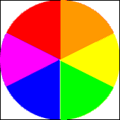
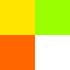
Secondary colors are ORANGE, GREEN, and , PURPLE. These colors are the combination of red and yellow (orange), yellow and blue (green), and blue and red (purple). They are represented in HTML as:
Orange: #ff9900 or #f90 in CSS
Green: #00ff00 or #0f0 in CSS
Purple: #ff00ff or #f0f in CSS
Tertiary Colors
Tertiary colors are YELLOW-ORANGE, RED-ORANGE, RED-PURPLE, BLUE-PURPLE, BLUE-GREEN, and YELLOW-GREEN. These are the combinations of the secondary colors. They are represented in
HTML as: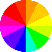
Yellow-Orange: #ffcc00 or #fc0 in CSS
Red-Orange: #ff6600 or #f60 in CSS
Red-Purple: #cc00cc or #c0c in CSS
Blue-Purple: #9900ff or #90f in CSS
Blue-Green: #00cccc or #0cc in CSS
Yellow-Green: #ccff00 or #cf0 in CSS
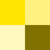
Monochromatic colors
Using colors of the same hue. They may have different tints or shades depending upon how much white or black is added. Monochromatic color schemes are often the easiest on the eyes of all the color schemes. The gentle changes in tint and shade make the colors flow into one another better. Use this color scheme to make your site appear more fluid and collected.
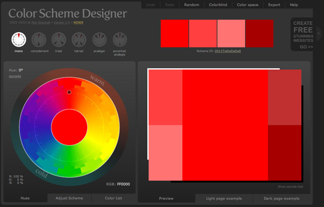
Analogous Colors
These are the colors that sit next to each other on the color wheel. For example: green, yellow-green, and yellow; or red, red-orange, and orange. Play with the hues and saturation of analogous colors to create a harmonious color scheme.

Complementary Colors
Complementary colors are those colors that are opposite one another on the color wheel. By using colors that are opposite one another, you create color schemes that have high contrast and so are brighter and more vivid. Some contrasting colors are: red and green or blue and orange. Photoshop makes it easy to get the complementary color – simply select the area of color that you want the complement of and hit Ctrl-I. Complementary color schemes are often a lot more striking than other color schemes, so use them with care. They are most often used on pieces that need to stand out.
Source: About.com, Web Design Basics
X. Be Consistent With Look and Feel
Using a wide range of different graphical elements — images, illustrations, symbols, logos, graphs, icons — can liven up a site and add visual variety. However, it is important that all of these elements have the same look and feel.
Eat: The Story of Food
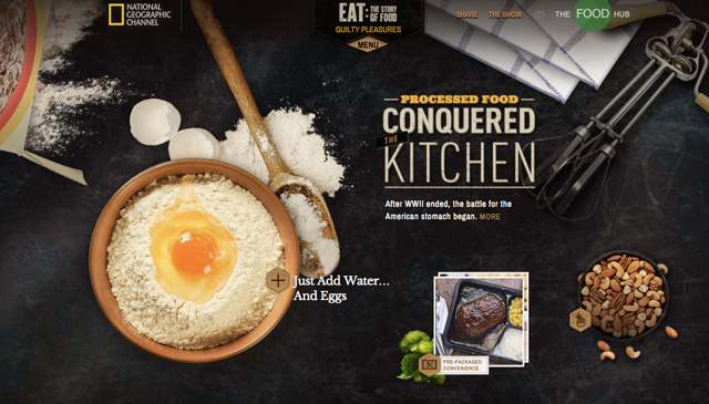 “Whether for meat or sugar, junk food or beer, humanity’s appetite has altered the planet, shaped our history and even altered our future. This six-part series is the epic story behind food and how it made us ‘us.'” – National Geographic
Congruity: Consistency in design
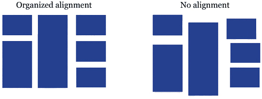
Congruity is having consistency in the relationship of the parts of a design: consistency in the placement of content and in the alignment of the content.
Repetition: Repeating similar decorative units
What if Stop signs came in pink squares, yellow circles, or green triangles, depending on the changing whims of a town and a few of its residents? Imagine the ensuing traffic jams and accidents. Repeating design elements and consistent use of type and graphics styles within a document shows a reader where to go and helps them navigate your designs and layouts safely.


Designers should abide by a general principle: design should offer the readers consistency; content should offer variety. That is, it should be the content — packaged in a consistent design — that gives the site its flavor and uniqueness.
Source: Web Journalism, James Stovall
To summarize:
Unity is the coherence and completeness of a design. Check your design using this list of questions.
* Is your design balanced either symmetrically or asymmetrically?
* Does it contain some repose to give breathing space in the page?
* Is related content consistently placed together?
* Are text and graphics consistent in their alignment with each other?
* Where applied, is your contrast strong enough to create intended emphasis?
* Have you employed repetitive use of colors, fonts, spaces to create continuity?
Inspiration
It can be helpful to collect web site bookmarks of sites that are similar to the type you want to create or that you think are original or creative in their design.
Two places to look for examples of good design:
Commarts Webpicks
Webby awards
Design Resources:
Mobile Patterns
Smashing Magazine: Newspaper Website Design: Trends And Examples
Visual Voice
Color Chart
Gallery of graphic design
Top 10 Resources for Design Inspiration
Interaction Design
Creative Navigation Menus
The Motive Web Design Glossary
Designing With Grid-Based Approach
Beginners Guide to Using the Power of Color in Web Design
Jakob Nielsen Top 10 Mistakes in Web Design
Understanding Visual Hierarchy in Web Design
9 Practical Ways to Enhance your Web Development Using the Firefox Web Developer Extension
Firefox add-ons
OJR: Eyetracking points the way to effective news article design
Journalist’s Toolbox
Tools for News