Mapping: Tools & Exercises
I. Mapping Tools


II. Exercise: Point map
Geocoding is just a fancy term for the process of converting a location to latitude and longitude coordinates. Google Fusion Tables automatically geocodes addresses, although you may have to provide some help to specify locations that it can’t find or figure out. There’s also a daily limit to the number of geocodings it can do for you.
1) Go to NYC Open Data and download this file: https://data.cityofnewyork.us/Housing-Development/Projects-in-Construction-Map/dzgh-ja44
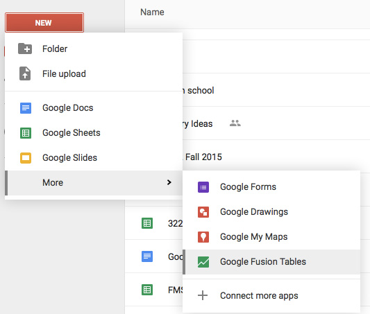
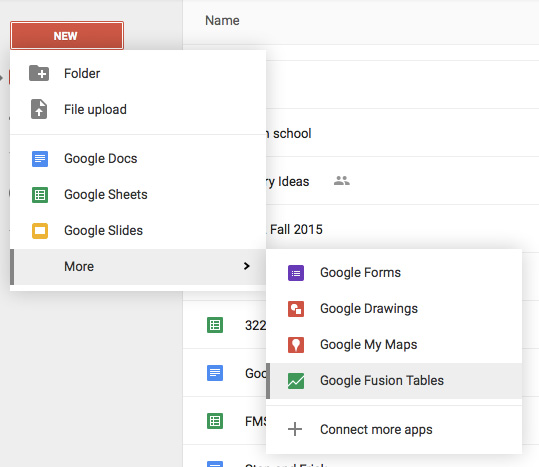
2) In your Google documents/Google drive home page, select Create > New > Table to create a new Google Fusion Table.
3) Choose the CSV file you just downloaded to your computer and click Next.
4) Google uploads the XLS file and shows you a preview of the fields.
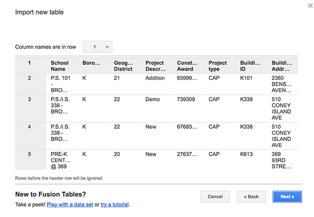 5) Click Next to create your new Google Fusion Table. Information highlighted in yellow, indicates that it has not yet been geocoded.
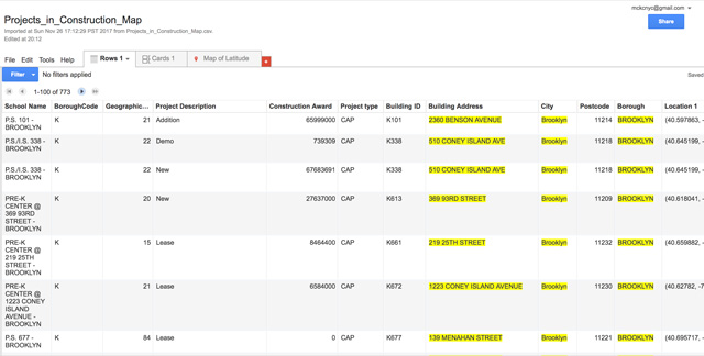
6) As with all spreadsheets, columns contain specific kinds of data. Sometimes it’s numeric data, sometimes it’s text, sometimes it’s a date. In some cases, you will want to make sure that Google knows that the Location column contains location data. In this file, there is a latitude and longitude provided so that is not necessary for the mapping.
7) Now, simply choose Map of Latitude.
8) Go to Change Info Window and uncheck all but the relevant data.
9) Go to Change Map Feature Styles > Buckets. Select 5 and the column Construction Award. Be sure to click “Use this range”
10) Edit the numbers on the key so that they are rounded. Round up at the end to 100,000,000.
11) Click on “Automatic Legend,” Show Marker Legend and select a location for the key.
III. Exercise: Boundary data, shapefiles and KML files
Displaying areas on maps requires a bit more information. If you want to color the different NY neighborhoods shades of red, depending on their population size, then you need to provide Google Fusion Tables with the boundary information for those neighborhoods.
Google Fusion Tables requires the boundary information be in the form of a KML file. A KML file (Keyhole Markup Language) is simply a text file that has vector information structured like an XML document. Vectors describe the points and paths of any shape in coordinates so it can be plotted on a map. Google Earth uses KML files.
Where do you get KML files for boundaries that you need? Fortunately, many common political boundaries (states, congressional districts, school districts, etc.) are available online from many diverse sources.
Some may be provided by local governmental agencies, such as the New York Department of City Planning. Others may be provided by the federal government or specific organizations (the UN, Census), and still others you may be able to find online in the Google Fusion Tables Public Search.
However, the geographic data is not always in the KML format. A common format for geographic data is the Shapefile, which is used by commercial GIS software applications such as ArcviewGIS, or its open-source version, QGIS. A shapefile comes in a .zip package, and when unpacked, there are multiple files that describe the geography. Fortunately, you can fairly easily translate shapefiles to KML files for use in Google Fusion Tables. One online tool you can use is Shape Escape.
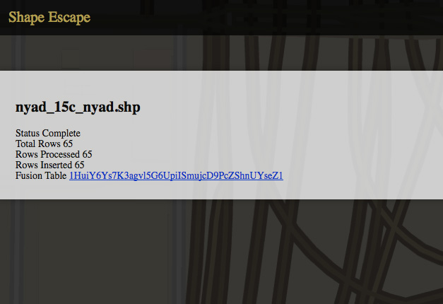 Download the boundary data for the Neighborhood Tabulation Areas from the NYC Department of City Planning. You’ll get a zip file called, “nynta_17.zip”. Go to Shape Escape. Upload the zipped file.
IV. Exercise: Mapping de Blasio’s Supporters in NYC
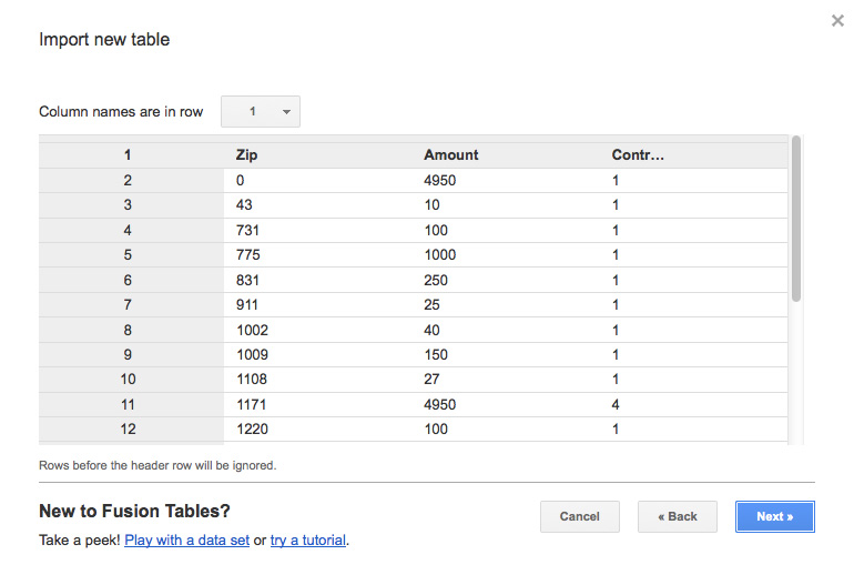
1) Find the de Blasio contributions CSV file you saved last week. Review it to make sure you don’t have any Grand Totals or other random data and that your top row is your column labels.
2) Upload it to Google Fusion tables.
3) Delete the zip code 083 in Central Park by clicking on the trash can in the first row of the de Blasio file.
4) If you haven’t already, Download zip file of NYC boundary files and find the NYC_zipcode.kml. Upload it to Google Fusion Tables.
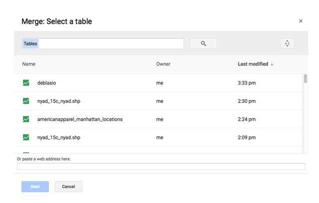
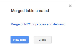
5) Merge it with the de Blasio boundary file.
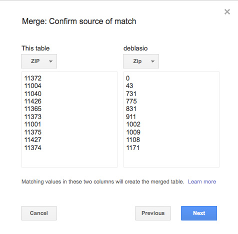
 6) Match the zip code columns.
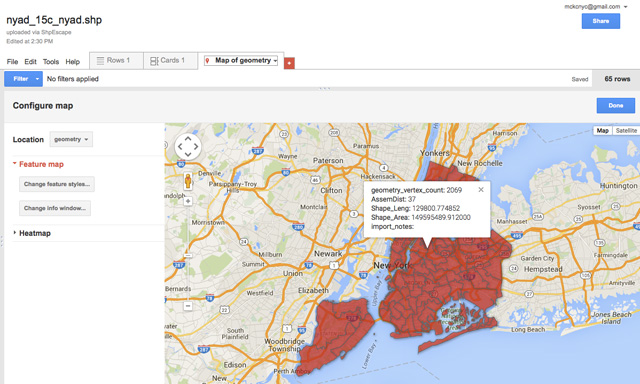
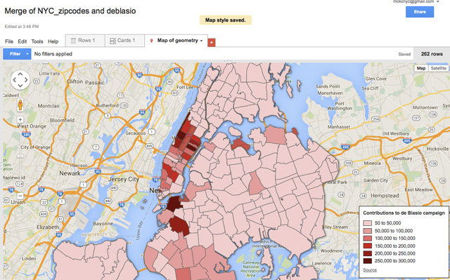
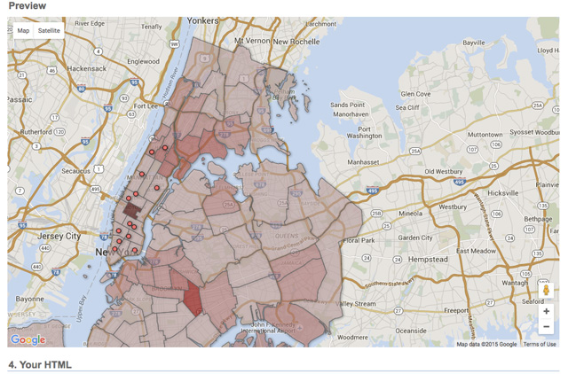
7) Click on Map of geometry. It should look something like this.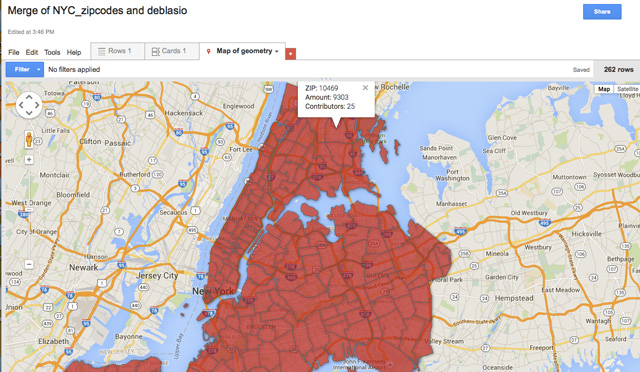
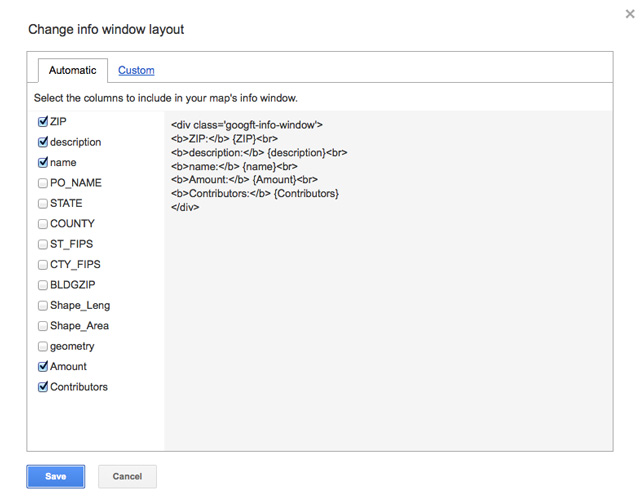
8) Change info window
Click on Tools > Change Map > Change info window. Uncheck everything but zip code and check amount and contributor.
9) Change map styles
Now you need to modify the map features. Go to Tools > Change Map > Change feature styles
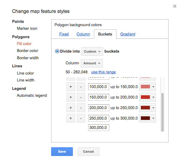
We are going to use Polygon > Fill color > Buckets >
- Select 6 buckets.
- In Column select “Amount”
- Next “use this range”
-Select the six shades of red from light to dark
- Modify the numbers by rounding them off.
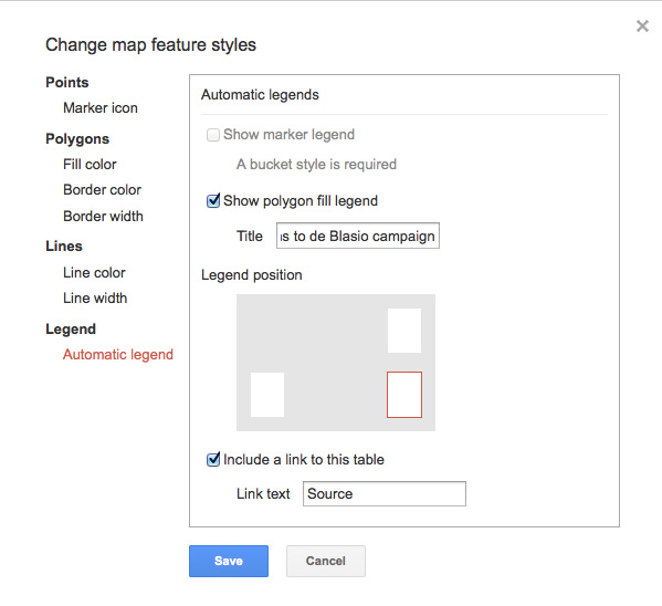
10) Add a legend. Select a location, rename the title.
It should look something like this.
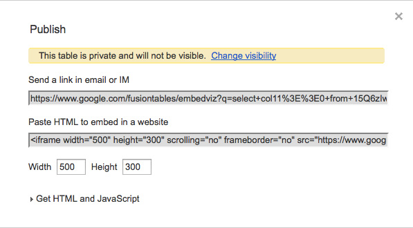
11) Publish and get the embed code for the map
VI. Exercise: Asthma Rates in NYC
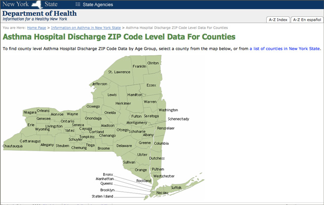
1. We are going to create the data by combining borough data from health statistics. 2008-2010 Hospital Discharge Rates for Asthma, by NYC ZIP codes:
http://www.health.ny.gov/statistics/ny_asthma/hosp/zipcode/map.htm
FYI: To assemble the data set click on each county (Queens, Kings, Bronx, Richmond, Manhattan).
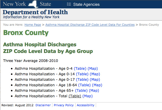 Click on TOTAL TABLE, and copy and paste each table into a new Excel file. The result will be all the zip codes for NYC showing asthma discharges, population, and rates.
Note the footnote!
* – Data is suppressed for confidentiality purposes if there are less than 3 discharges per ZIP code or if the average annual population in each ZIP code contains less than 33 people.
+ – Less than or equal to 10 discharges, therefore rate may not be stable (RSE>30%).
You can deal with the footnote in the map itself (you can filter out all the discharges less or equal to 10). Delete all the asterisks and Plus symbols from the spreadsheet.
2. Upload the completed CSV. It is here HospitalAsthmaDischarge.csv in your folder. You can also find it here.
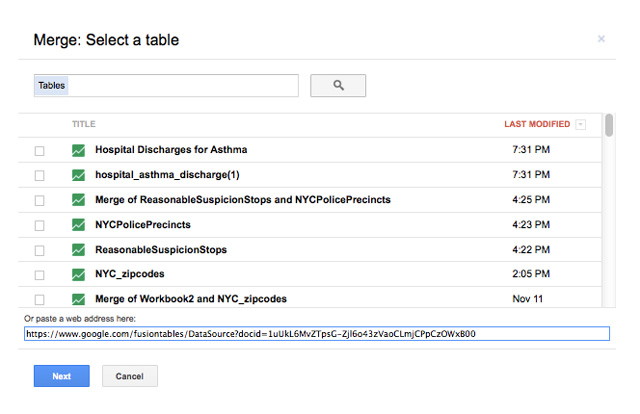
3. Go to File > Merge and merge the Hospital Asthma data with the zip code file we uploaded earlier. Or you can paste this URL into the field at the bottom of the box.: https://www.google.com/fusiontables/DataSource?docid=1uUkL6MvZTpsG-Zjl6o43zVaoCLmjCPpCzOWxB00
4. Click on the “Map of Geometry” tab on the upper-right hand side of the table. This should display the map.
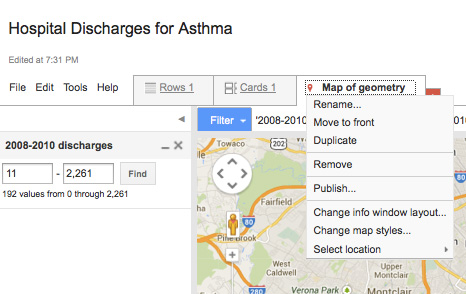
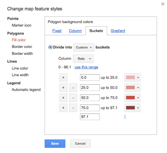
5. Then click on the “Change Feature Styles”. If it is not visible, click on Tools > Change Map. Click on Polygon fill. Next, navigate to the “Bucket” tab on the right. Then, choose Divide by 4 buckets. Next, select the “Rate” from the pulldown menu next to “Column.
6. Underneath the Rate, you will see a range of numbers and a link to “use this range.” Click on that link. Next go and round up the numbers to 0-25, 25-50, 50-75, 75-97.1. Hit “save”
7. In this study, some information was not usable due to confidentiality concerns. For example, in instances where there were very few hospital cases of asthma (any less than 10)
8. To eliminate this odd data, we are going to restrict our map to discharges greater than 10. So, go to Filter>2008-2010 discharges. Next insert 11 – 2261

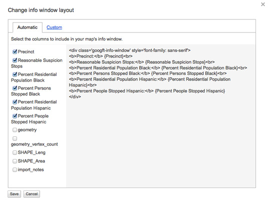
9. Next we are going to tidy up the info window. Go to Tools > Change Info Window. Uncheck all but the following.
ZIP Code: {ZIP Code}
2008-2010 discharges: {2008-2010 discharges}
2008-2010 population: {2008-2010 population}
Rate: {Rate}
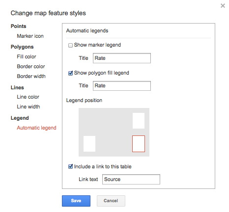
10. Add a map legend by going to Tools> Change Map Tools > Automatic Legend. Select “Polygon fill”
VI. Exercise: Stop and Frisk
Use Google Fusion Maps to Try and Answer Some of These Questions
1) Identify your data sets and what you want to illustrate. Example: I am going to show the number of 2011 stop and frisk incidents by police precinct. I am also going to include a racial breakdown of these stops.
Data source: NYPD – 2011 Reasonable Suspicion Encounters
2) Prepare your data and locate the appropriate shapefiles, depending on the geographical parameters of your graphic: borough, community district, precinct, block etc.
Data set: Reasonable Suspicion Stops (CSV, comma separated values)
Precinct boundaries: NYC Police Precincts
3) Upload your data sets to Google Fusion Tables.
4) Click on Reasonable Suspicion Stop. Go to edit>merge
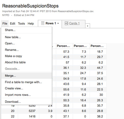
5) Select Police Precincts
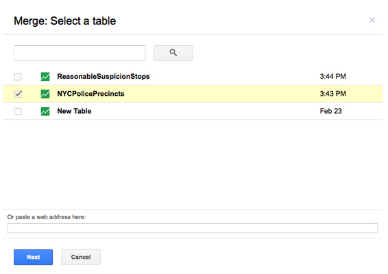
6) Confirm that the correct row is selected for the titles.
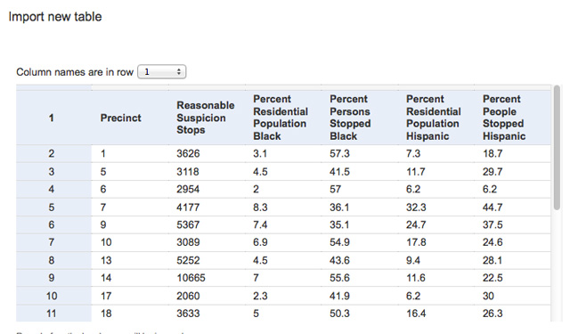
7) Make sure that they both are synced to Precinct
8) Click on Map View, then under Tools, select Change Info Window Layout
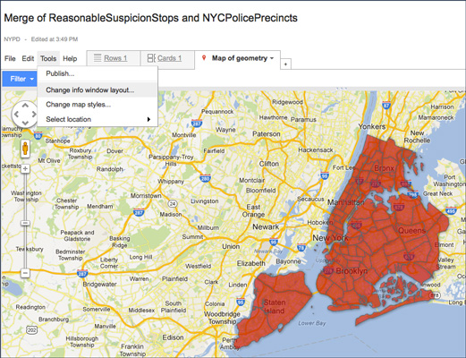
9) Delete all information except for the precinct number, the number of stops, the population and stops for black and Latinos.
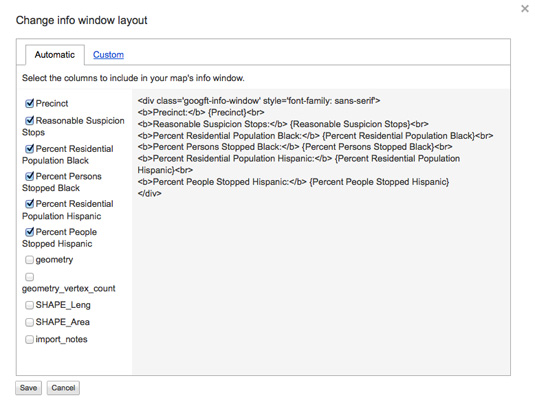
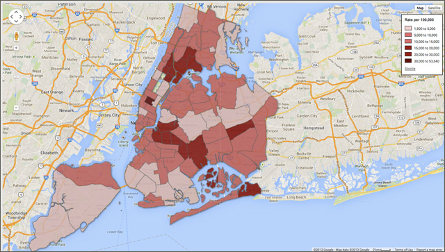
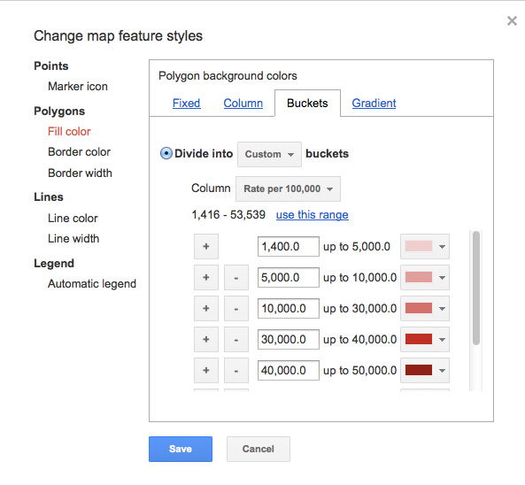
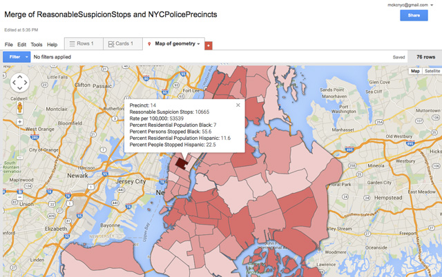
10) Now, in the Tools menu, select Change Map Styles. Here you are going to select Fill color > Buckets. Select five buckets and the column should be Reasonable Stops. Once you select that, it will show you the range of numbers and ask if you want to use that data set. This will spread the data evenly over the five buckets. You can adjust it to make the statement you wish to make. In this case, we want to round up the numbers, with 31,005 as the final bucket.
Analysis
- How do the absolute numbers compare to the normalized?
- Example. Check out the top two precincts for stop and frisk, the 73rd and the 75th, in terms of absolute numbers. By this measure, they fall into the same dark shade of red, but when you normalize the data they are quite different.
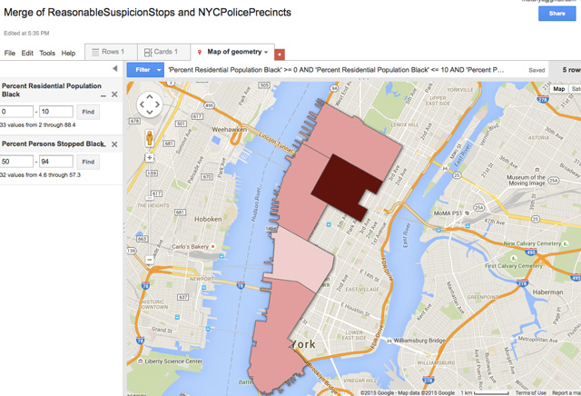
- Use filters to determine what precincts have a disproportionate number of stops for minorities.
A precinct where a disproportionate number of African Americans are stopped:
A precinct where a disproportionate number of Latinos are stopped: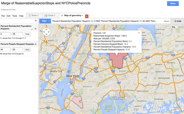
Other information found in the 2011 report. How could this data be used to further illuminate the stop and frisk topic?
Top crime suspected reason during stop.
All known suspects
Known violent crime suspects
Radio runs
Total crime complaints
Arrests and criminal court summonses issued
Things to consider:
- What biases may exist in your data source? Crosscheck these with a neutral expert. You might also consider the opposing point of view. In the case of stop and frisk, the NYCLU has been working on this issue, what does its data say?
- If you are entering data yourself, double-check all of your work to make sure you haven’t make errors.
- Use your common sense. Does something seem unrealistic? If so, maybe the math is wrong.
Student Examples:
Lottery
Hunger and Food Stamps
Illegal Occupancy
311 Complaints