Mapping Data – Why, When & How
Function of maps in stories
1) Show where and how something has happened
Tracking the Oil Spill in the Gulf
Some stories are about clearly suited for a map because a big part of the story is about geography, like this interactive that illustrates the estimated amount of oil spilled in the Gulf of Mexico and where it has traveled to the shore.
![]()
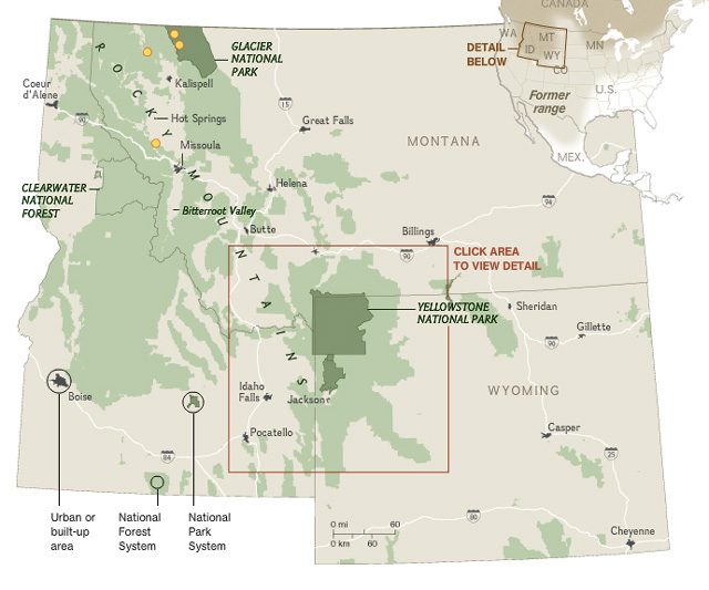
Return of the Wolf
Exterminated as vermin, grey wolves disappeared from the lower 48 in the 1930s. In 1995/1996, the US airlifted 66 wolves from Canada in an experiment to repopulate Yellowstone National Park. By the end of 2008, the northern Rocky Mountain states held more than 1,645 wolves, 1,500 of them living outside national parks.
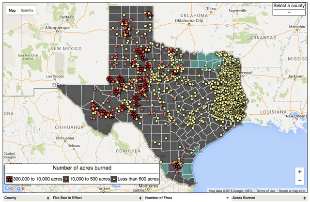
Texas Wildfires
2) To make comparisons
How did the votes from one district compare to another? Which state has the highest or lowest teen pregnancies? What area of the city has the highest density of bicycle accidents?
Mayor’s race in New York from WNYC
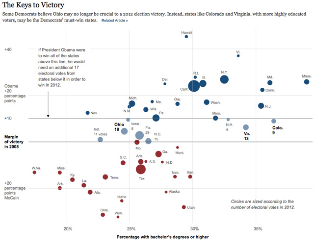
In Climbing Income Ladder, Location Matters
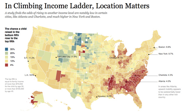
These comparisons provide some of the most powerful evidence so far about the factors that seem to drive people’s chances of rising beyond the station of their birth, including education, family structure and the economic layout of metropolitan areas.
How fast is LAFD where you live?
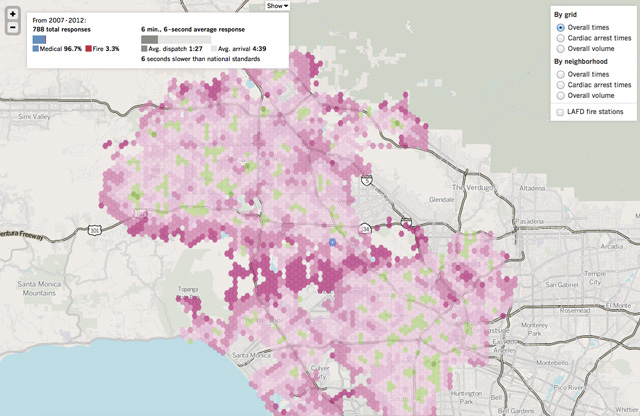
“The Times analyzed more than a million runs by the Fire Department over the last five years and found that what Angelenos can expect often depends on where they live. You can read about the causes and patterns in the Times story.”
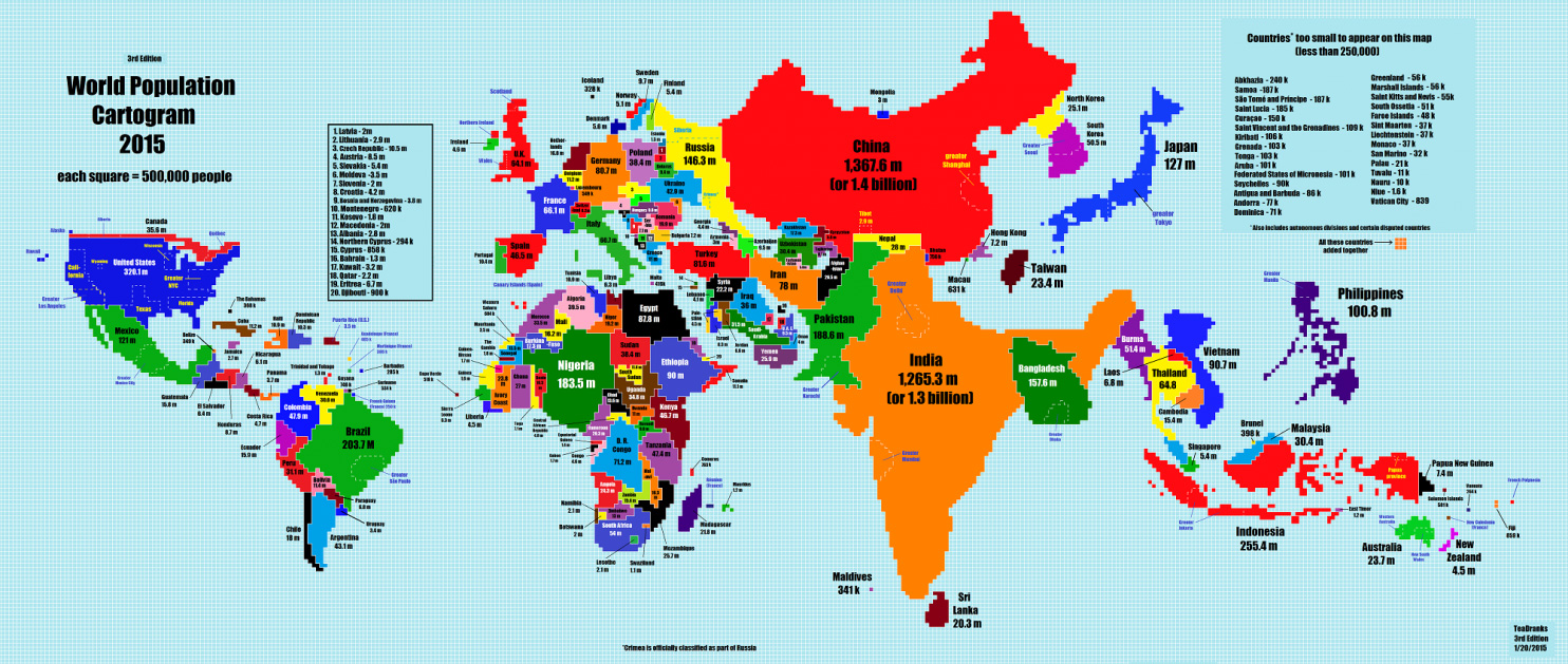
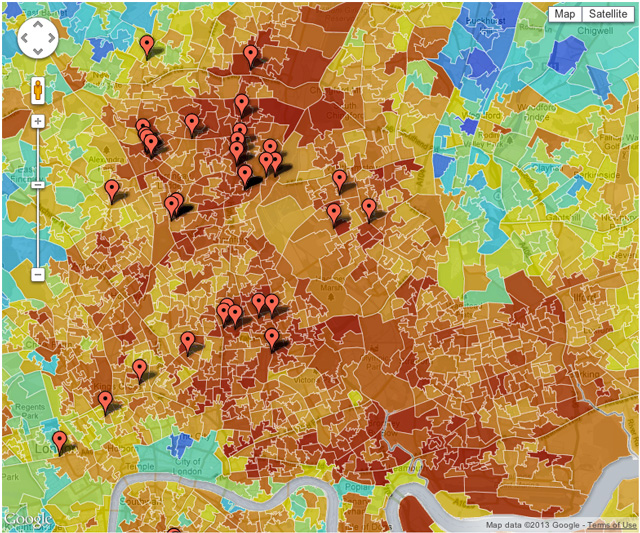
Cartogram
3) To show major trends/patterns, change over time
Guardian: Executions in the US

• Texas is the big state for executions – with 474 since 1976, followed by Virginia
• California has more inmates on death row than any other state – 721. The state has not had any executions since a 2006 moratorium but procedures are set to restart for Albert Greenwood Brown, whose execution was suspended last year. One problem is that the state’s supply of sodium thiopental has expired
• Texas is only behind Oklahoma if you look at the rate of executions per million population
• Alabama has 43 defendants on death row for every million people
4) To drill down: by state, city, county, borough, zip code, census tract
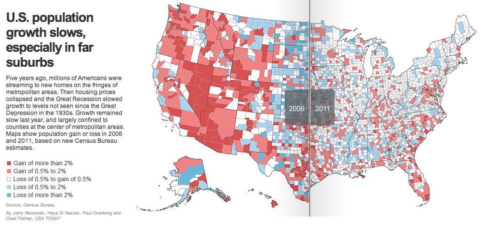
A good map, like all good data visualizations, provide the big picture first, and then allow us to drill down and examine how the big picture relates to our own personal location/experience. A map with different colored areas is called a chloropleth map. The different colors represent different amounts of a certain variable. The raw numbers of population growth is valuable and interesting, but percentage change tells us more about impact.
Mapping the Bacteria in New York’s Subways
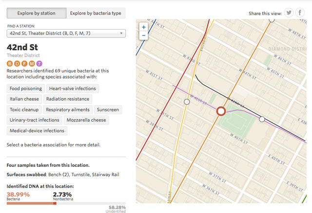
“Researchers at Weill Cornell Medical College sampled DNA in New York City’s 466 open subway stations. They found genetic material from 15,152 different species. Almost half the DNA belonged to bacteria. So far, the scientists have identified 67 bacteria species associated with disease and infections.”

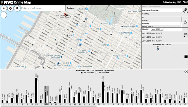
Each day, the New York Police Department announces major crimes, including most homicides, in the five boroughs. This data is compiled from those reports, in addition to news accounts, court records and additional reporting. In this feature, viewers can review crime data through various filters in order to discover patterns.
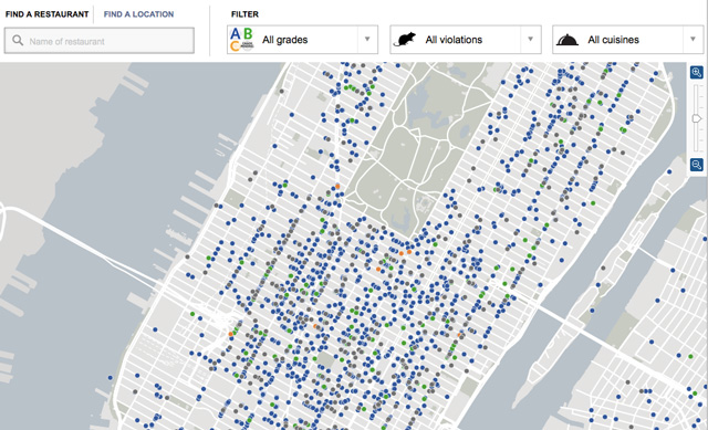
NYC Health Department Ratings
5) Examine causes and effects and reveal interrelationships.
 John Snow’s 1854 map of cholera outbreaks in London. In an age where the pathogenesis of disease wasn’t clearly understood, he mapped out each case of cholera, and most importantly, made a correlation with the location of the city’s water pumps. The correlation suggested that water contamination had something to do with the spread of cholera, and the data visualization in the form of the map was instrumental at arriving at the conclusion.
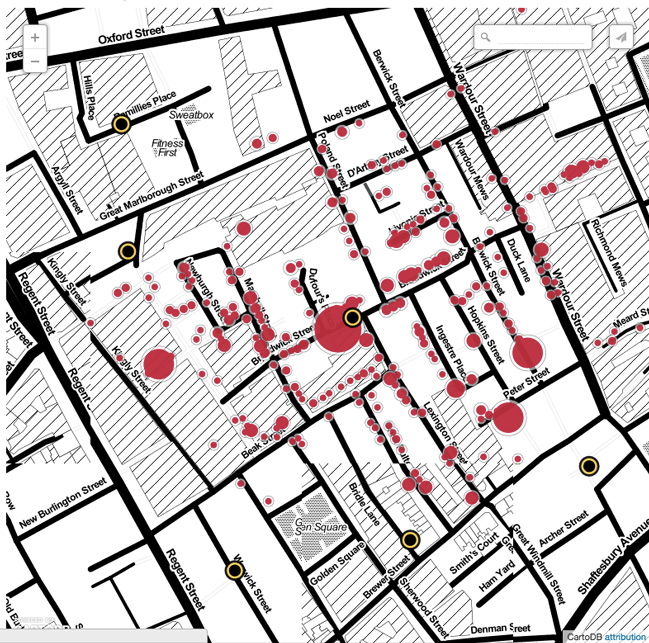
Mapping the riots with poverty
A Liverpool University urban planning lecturer, Alex Singleton, analysed the Guardian’s preliminary data by overlaying the addresses of defendants with the poverty indicators mapped by England’s Indices of Multiple Deprivation, which breaks the country into small geographical areas.
He found that the majority of people who have appeared in court live in poor neighbourhoods, with 41% of suspects living in one of the top 10% of most deprived places in the country. The data also shows that 66% of neighbourhoods where the accused live got poorer between 2007 and 2010. — Guardian, England rioters: young, poor and unemployed

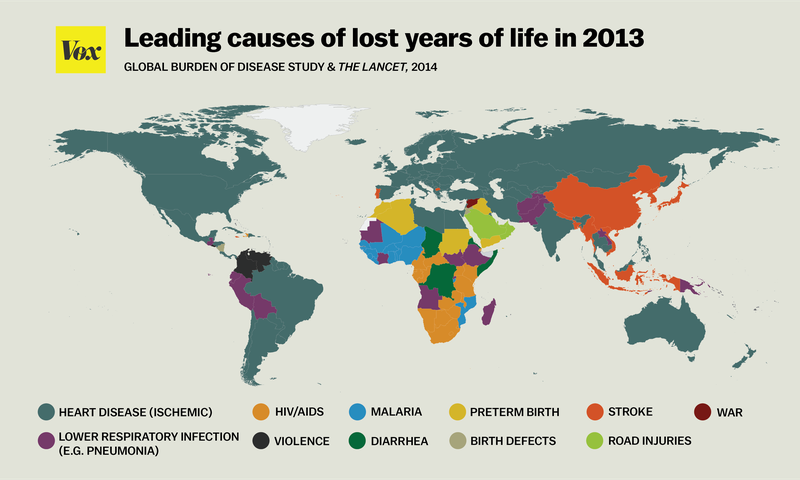
6) Summarize a situation
40 maps that explain the world, 40 more maps that explain the world
B. When stories are not about geography
It may be difficult at first to know whether a map will actually be useful for a reader. Think carefully whether seeing the geographic distribution of the data is most important.
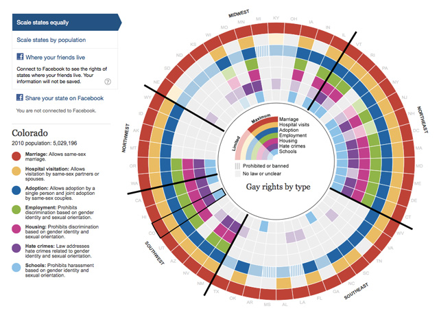
Sometimes, not plotting your data on a map provides a fresher face on an issue. The Guardian created this interactive feature on gay rights in the US, which groups states in regions rather than presents them in the traditional geography.
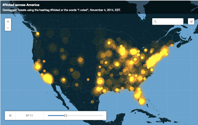
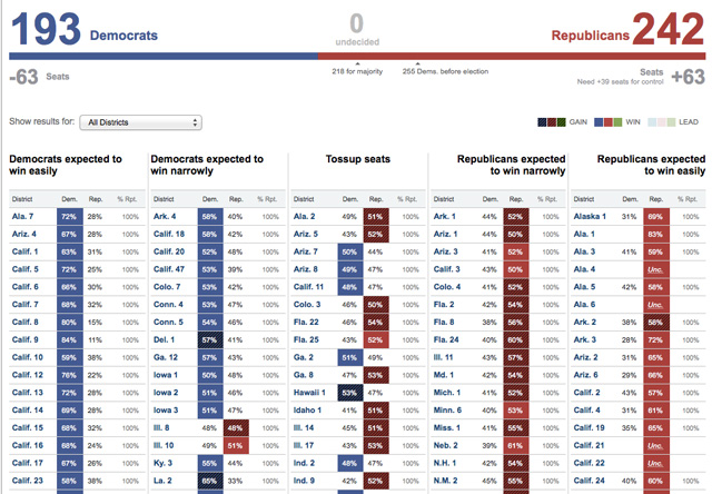
Eye Candy: Voted across America
Details: One word on election day

The Strong Democratic seats are in a column on the left, the Strong Republican seats are on the right, with the leaning and toss-ups seats in-between. So, as results come in throughout the night, you should expect to see mostly blue on the left, mostly red on the right, and a mix of colors in the middle.
Resource: When Maps Shouldn’t Be Maps
II. Steps to build a interactive map
A. Identify your data set and the most relevant geographical parameter
Parameters: census tract, zip code, county, precinct, school district, congressional districts, etc.
B. Find the geodata
Displaying areas on maps requires a geographical information — latitude and longitude. If you want to map the different NY neighborhoods depending on their population size, then you need to combine the demographic data with the boundary information for those neighborhoods.
There are a different types of boundary data:
KML: KML (Keyhole Markup Language) is simply a text file that has vector information structured like an XML document. Vectors describe the points and paths of any shape in coordinates so it can be plotted on a map. Google Earth uses KML files.
Shapefiles: A shapefile is a format for transferring geographic data. Shapefiles are collections of three or more files that represent features such as points, lines, and polygons. Shapefile, is used by commercial GIS software applications such as ArcviewGIS, or its open-source version, QGIS. A shapefile comes in a .zip package, and when unpacked, there are multiple files that describe the geography. Fortunately, you can fairly easily translate shapefiles to KML files for use in Google Fusion Tables using tools like Shape Escape.
Sources of boundary data:
 J-school Research Center
NYC Department of City Planning
- Borough Boundaries & Community Districts
- School, Police, Health & Fire
- Census Blocks & Tracts
Census
Bronx blocks
Columbia: NYC KML Files
Download zip file of most commonly used NYC geographic boundary files
C. Normalize
Keep in mind. Sometimes you may need to normalize your data or your map may simply reflect population differences:
Sometimes the difference is subtle but it can be important. Other times both absolute and normalized data will be useful.
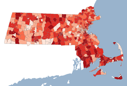
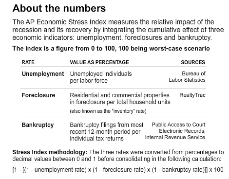
Figure 1. Unemployment by ZIP – raw count (not normalized)
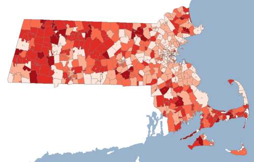
Figure 2. Unemployment by ZIP – normalized by total labor force
III. Map Elements
Key map elements include the title, legend, and links to primary sources. Remember that you are creating content for lay audiences and you should use language that is understandable to non-experts. Give a link to the raw numbers or to the spreadsheet file itself.
Color Brewer is an indispensible resource for finding good gradients and color palettes so you don’t have to become an expert on color theory, color blindness, hue and saturation.
A legend is important to translate the visual (qualitative) information in the map to quantitative information.
IV. Resources
Using Web Maps to Tell Your Story
Amanda Hickman: Mapping
100 Things to do with Google Maps Mashups
V. Previous class data sources
BLS: Labor Force Statistics from the Current Population Survey